4:29


Elm Ave Parking Facility
Parking Lots
4:29
Elm Ave Parking Facility
Commuter Parking Levels:
3 & 4
Available spots:
29

Slide to Confirm
Overview
Parking on campus was a daily struggle for me and 28,000 other students, so I set out to change that. OU-PARK is a smart, easy-to-use app designed to help students find available spots, view parking areas, and get real-time updates. Driven by research and user feedback, I refined the design to ensure a smooth experience. This project showcases my ability to turn everyday frustrations into practical, effective solutions.
My Role: UX Designer
Responsibilities: I was responsible for all design aspects, including user research, wireframing, interface design, and user testing to refine the product.
Understand The Problem
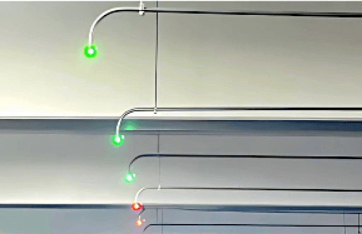
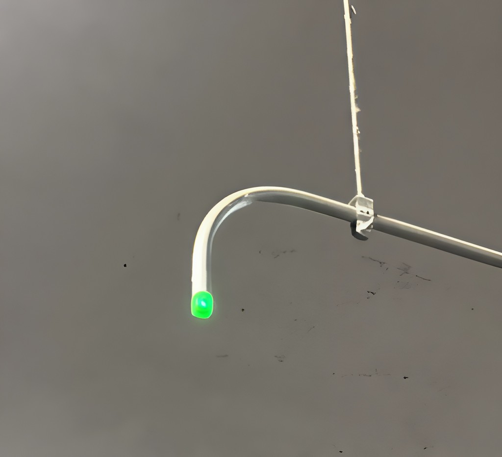
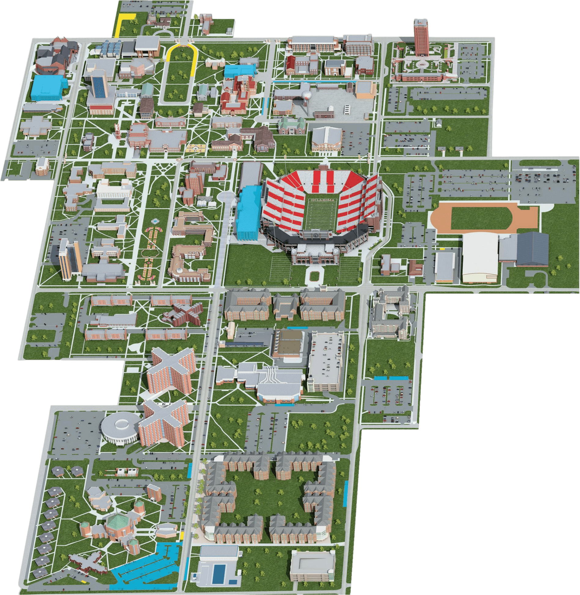
Parking at the University of Oklahoma is a constant struggle for students and faculty, with limited spaces and unpredictable availability. What’s the result? Wasted time, stress, and frequent lateness to classes and meetings. Without real-time updates, it’s impossible to know where spots are open, leading to frustration and traffic jams. The image below illustrates the campus layout, highlighting the vast parking areas and the challenges of navigating them without an efficient system.
What can be done to make parking on campus more efficient and less stressful for everyone?
My Inspiration
As a commuter at the University of Oklahoma, I constantly found myself circling parking garages, frustrated by the unpredictable availability and running late to class. I noticed the green and red indicator lights in the garages—helpful, but only visible once inside. That sparked an idea: what if this real-time data was accessible before even entering the garage? I set out to create a smarter, more efficient way to navigate campus parking.
Design Process
Step into my shoes and follow the journey of how I created OU-PARK, from identifying the problem to designing a solution that simplifies campus parking.
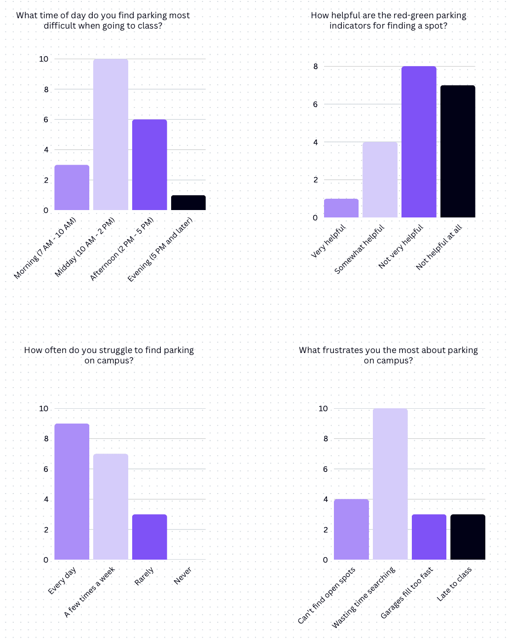
Research- Summary Insight of Survey Results
I surveyed 20 people, including commuter students, on-campus residents, and faculty members such as graduate assistants and TAs, to understand their parking struggles. Many reported wasting time searching for spots, frequent lateness, and frustration with the current red-green indicators. The feedback highlighted the need for a real-time parking solution, shaping the core features of OU-PARK.
From Sketch to Screen: Bringing OU-PARK to Life
In this section, you’ll see the foundation of OU-PARK take shape. From initial hand-drawn sketches to detailed low-fidelity wireframes, these designs outline the core functionality and user flow of the app. This stage was crucial in mapping out an intuitive experience before moving into high-fidelity prototyping.
Improving the Design
The iteration phase focused on enhancing user navigation based on feedback. Users found the parking garage layout confusing, so I improved visibility by extending the car location animation and adding distinct green and red car icons to indicate available and occupied spots. The user's car icon now turns red when parked, making the experience more intuitive and effortless.
Enhancing User Feedback
I added a confirmation to inform users of their actions and provide a better understanding of what just occurred, specifically confirming that the user has successfully parked in an available spot. This confirmation will display the parking level where the user parked, along with a parking pass for that level, ensuring they have all the necessary details for easy access to their parking spot.
Bringing It All Together
The final design of OU-PARK brings together user feedback, research insights, and iterative improvements to create an effective parking solution. Every element was designed to enhance usability, clarity, and convenience, ensuring a smoother experience for the OU community.
Onboarding
Upon opening the app, users sign in with their OU email (@ou.edu) or create an account if they are new. After signing in, they must allow location access for accurate parking information.
The Solution
The OU-PARK app provides a simple, effective solution to the University of Oklahoma's parking problems. It works with the existing parking system to provide real-time information on available parking across campus. This allows users to see open spaces before arriving, saving time and reducing stress.
A key challenge was the frustration of driving around looking for parking. OU-PARK solves this with a navigation feature that brings users to locations with the best parking available at that moment, cutting down on unnecessary driving.
In addition to easing parking stress, the app improves the overall campus experience, making commuting more efficient and enjoyable for everyone at the University of Oklahoma.
Projected Success Metrics
OU-PARK aims to achieve the following measurable outcomes once launched:
Reduce Search Time
Goal: Cut the average parking search time from 15 minutes to less than 7 minutes.
Reason: Saves time and reduces stress for users, improving parking-campus convenience.
Enhance User Satisfaction
Goal: Achieve a 4.5/5 average user satisfaction score in post-launch surveys.
Reason: Real-time updates and guidance foster trust and convenience for users.
User Engagement
Goal: Engage 70% of students and staff to actively use the app within the first semester.
Reason: Based on early surveys, respondents expressed willingness to use an app like OU-PARK regularly to find parking.
Anticipated Outcome: Increased engagement will lead to more efficient parking and fewer parking-related issues.
Sign Up
End Session


4:29
4:29

Elm Ave Parking Facility
Parking Lots
4:29
Elm Ave Parking Facility
Commuter Parking Levels:
3 & 4
Available spots:
29

Slide to Confirm
Sign Up
Available
Unavailable
Parking spot selected!
You are now parked on Level 3 with a commuter parking pass. The green light for your spot is now red. Please confirm that you are parked in this spot.

Confirm
Cancel
Select Parking
Level 3
Level 4
4:34


Foundation
Research
Testing
Final Design
Review
Final Design
Parking Selection
On the home page, users can browse through top tabs to choose specific parking options and explore nearby parking garages. After selecting a garage, users choose their parking permit type, and availability will be displayed, showing the levels and the number of available spots. Once satisfied, users can click to continue.
Reflection:
Developing OU-PARK taught me the importance of creating a simple and clear user experience. I realized that strong design goes beyond functionality and appearance; it’s about ensuring an effortless flow for users. My main challenge was balancing innovation with usability. While I wanted to include features like real-time updates and parking maps, I had to avoid overwhelming users with complexity. By prioritizing essential features, I created an app that meets user needs while remaining easy to use. Moving forward, I plan to collaborate with campus officials to improve OU-PARK and explore expanding it to other campuses.
Final Design
Navigation Confirmation
After selecting a garage, users slide to confirm their choice, indicating their destination. The map will then begin guiding them to the parking garage.
Parking Completion
Upon entering the parking garage, green car icons highlight available spots, while red icons show unavailable ones. Select a green spot, and once parked, the icon turns red, signaling successful parking. A confirmation message will appear, and after clicking "Confirm," a thank you message will be shown along with a prompt to rate your experience. After submitting your rating, you’ve completed the entire app journey.
© 2024 Kimberly Ume Ezeoke
© 2024 Kimberly Ume Ezeoke
© 2024 Kimberly Ume Ezeoke
Onboarding
Upon opening the app, users sign in with their OU email (@ou.edu) or create an account if they are new. After signing in, they must allow location access for accurate parking information.
Final Design
Parking Selection
On the home page, users can browse through top tabs to choose specific parking options and explore nearby parking garages. After selecting a garage, users choose their parking permit type, and availability will be displayed, showing the levels and the number of available spots. Once satisfied, users can click to continue.
Reflection:
Developing OU-PARK taught me the importance of creating a simple and clear user experience. I realized that strong design goes beyond functionality and appearance; it’s about ensuring an effortless flow for users. My main challenge was balancing innovation with usability. While I wanted to include features like real-time updates and parking maps, I had to avoid overwhelming users with complexity. By prioritizing essential features, I created an app that meets user needs while remaining easy to use. Moving forward, I plan to collaborate with campus officials to improve OU-PARK and explore expanding it to other campuses.
Final Design
Navigation Confirmation
After selecting a garage, users slide to confirm their choice, indicating their destination. The map will then begin guiding them to the parking garage.
Parking Completion
Upon entering the parking garage, green car icons highlight available spots, while red icons show unavailable ones. Select a green spot, and once parked, the icon turns red, signaling successful parking. A confirmation message will appear, and after clicking "Confirm," a thank you message will be shown along with a prompt to rate your experience. After submitting your rating, you’ve completed the entire app journey.
© 2024 Kimberly Ume Ezeoke
Onboarding
Upon opening the app, users sign in with their OU email (@ou.edu) or create an account if they are new. After signing in, they must allow location access for accurate parking information.
Sign Up
End Session

4:29
4:29

Elm Ave Parking Facility
Parking Lots
4:29
Elm Ave Parking Facility
Commuter Parking Levels:
3 & 4
Available spots:
29

Slide to Confirm
Sign Up
Available
Unavailable
Parking spot selected!
You are now parked on Level 3 with a commuter parking pass. The green light for your spot is now red. Please confirm that you are parked in this spot.
Confirm
Cancel
Select Parking
Level 3
Level 4
4:34
Project Overview
OU-PARK is an app I designed and created to improve parking efficiency at the University of Oklahoma. As the sole designer, I was responsible for all design aspects, including user research, wireframing, interface design, and user testing to refine the product. My goal was to develop an intuitive, solution-focused tool that addresses campus parking frustrations, helping users find available spots, view parking areas, and receive real-time updates on availability. I prioritized feedback-driven improvements to ensure OU-PARK remains effective and relevant for the OU community. This project showcases my end-to-end product design skills, from research and usability to iterative design.
Understand the Problem
Parking at the University of Oklahoma is a constant struggle for students and faculty, with limited spaces and unpredictable availability. What’s the result? It’s wasted time, stress, and frequent lateness to classes and meetings. Without real-time updates, it’s impossible to know where spots are open, causing frustration and traffic jams.
What can be done to make parking on campus more efficient and less stressful for everyone?
My Inspiration
My inspiration for starting this project comes from my experiences as a commuter at OU, circling parking garages and being late to class due to unpredictable parking availability. I noticed these lights in the garages, which indicate green for available spaces and red for full ones; however, they are only visible when entering a garage. This led to the idea of incorporating real-time data into a mobile app to improve the parking experience for the OU community.

Design Process
Foundation
Research
Testing
Final Design
Review

Kira
20 years old
Commuter student at the University of Oklahoma
Kira struggles to find available parking during peak hours, often wasting time and feeling frustrated as she searches for a spot. She frequently ends up parking far from her classes, leading to long walks across campus and sometimes even making her late.
Problems
Needs
Real-time updates on parking availability.
Quickly find parking, especially when in a rush or short on time.
Sign Up
Available
Unavailable
Parking spot selected!
You are now parked on Level 3 with a commuter parking pass. The green light for your spot is now red. Please confirm that you are parked in this spot.
Confirm
Cancel
Select Parking
Level 3
Level 4
4:34


Parking SoltuijnaAppp for the Unversit yof Oklahoma
Sign Up
Select Your Spot!
Available
Taken Spots
Available
Available
Available
Available

Available
You Are Here!
Available

Available
Available
Available
Available
Available
Available

Available

Available


Available

Available
Level 3
Level 4
4:29
Sign Up
Available
Unavailable
Select Parking
Level 3
Entry
Level 4
4:34
Sign Up
Available
Unavailable
Parking spot selected!
You are now parked on Level 3 with a commuter parking pass. The green light for your spot is now red. Please confirm that you are parked in this spot.
Confirm
Cancel
Select Parking
Level 3
Level 4
4:34
Parking Selection
On the home page, users can browse through top tabs to choose specific parking options and explore nearby parking garages. After selecting a garage, users choose their parking permit type, and availability will be displayed, showing the levels and the number of available spots. Once satisfied, users can click to continue.
Reflection
Developing OU-PARK taught me the importance of creating a simple and clear user experience. I realized that strong design goes beyond functionality and appearance; it’s about ensuring an effortless flow for users.
My main challenge was balancing innovation with usability. While I wanted to include features like real-time updates and parking maps, I had to avoid overwhelming users with complexity. By prioritizing essential features, I created an app that meets user needs while remaining easy to use. Moving forward, I plan to collaborate with campus officials to improve OU-PARK and explore expanding it to other campuses.
Navigation Confirmation
After selecting a garage, users slide to confirm, and the integrated map provides navigation with real-time parking availability updates and notifications.
Parking Completion
Upon entering, green icons mark open spots, red for taken. Parking turns your spot red, triggering a confirmation and thank-you message, followed by a rating prompt.
© 2024 Kimberly Ume-Ezeoke
Key. Inspire. Manifest.
Key | Inspire | Manifest reflects my approach—unlocking creativity and sparking inspiration. I design with heart and creativity, blending innovation and empathy to craft impactful, memorable experiences that spark lasting connections.
Contact Me
View Resume

